Kickstarter: Project Creation Redesign
Background
This project is part of Bitesize's Kickstarter Redesign Contest. I entered the contest in order to test my critical thinking and design skills — and to simply have a chance of $100 at the same time!
It also provided an excellent opportunity to receive feedback from three Senior UX Designers to develop my skills.
CLIENT
Kickstarter
TEAM SIZE
Solo UX Designer
TIMELINE
March 24'
(2 Weeks)
DELIVERABLES
Prototype
Problem and Context
A summary of the problem, context, and constraints.
Problem
Kickstarter is seeing a huge drop-off on the first step of the project creation screen. People want to create a project, and then abandon it once they are asked these questions.
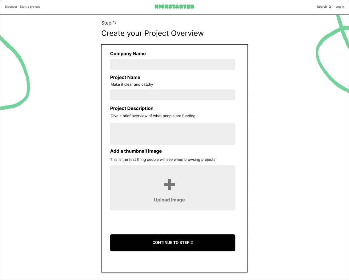
The case study is based on an old Kickstarter user flow and screen.
All fields are part of the project parameters only and does not include current ones such as: video upload or budget goal.
User feedback was provided to me for this project and I was encouraged form my own assumptions to develop the solution based on the provided information.
Ideation
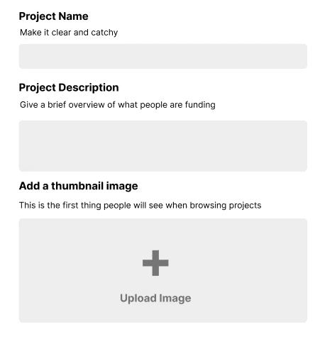
I chose to break down screen shot of the project to identify possible problems that users might face.
User Feedback
I first took a look at the user feedback in order to identify the user frustrations. The feedback acted as guidance as why Kickstarter is facing a drop-off in project creation.
Why do users experience frustrations?
Creators don’t know what their project is going to look like when users see it on the front end.
Creators know that a first impression is important, but need some guidance on good titles, descriptions, and images.
Creators aren’t sure if they’ll be able to edit this later, or before they launch it (they can)...this causes them to abandon until they have the perfect copy and images
I broke down the screen of the project overview and found possible problems based on assumptions. My assumptions are based or inspired by UX laws and practices.
My assumptions also acted as the core foundations of the redesign with small quality of life changes applied later.
ASSUMPTION 01
Provide Step Counts
Users don't complete the goal because they don't know how many steps or the time it takes to finish. Adding progress steps should increase completion rate based on the Goal-Gradient Effect.
Reasoning
Progress steps give clear indication of progress to motivate users.
The closer users are to completion, the likelier they are to complete the task.
ASSUMPTION 02
Reduce Uncertainty
The current process does not allow users to see how their information would be articulated into a card on the front end. Inspired AND based on the heuristic of the visibility of system status.
Reasoning
A card preview reflects changes on how the card will appear on the front-end, reducing their uncertainty.
Previews reduce frustrations by providing user feedback based on their changes.

ASSUMPTION 03
Provide Resources
Users are paralyzed because they have no guidance on the current form. Providing resource material on writing descriptions or taking good images encourages users to complete the form. Inspired by progressive disclosure.
Reasoning
Providing materials encourages the user to completion instead of paralysis.
Users are less likely to feel overwhelmed when guidance is provided.
Other Problems
I discovered other problems that could result in lower task completion rates.
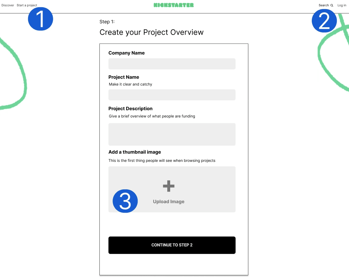
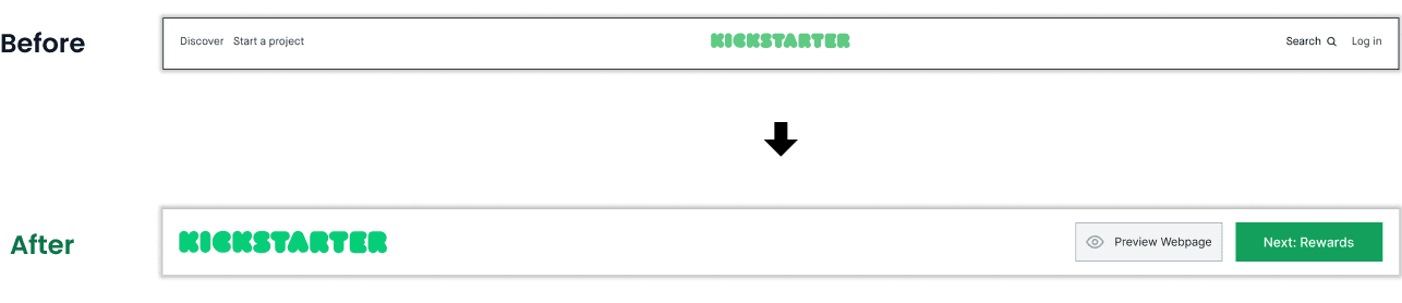
"Discover" and "Start a Project" hampers completion rate by providing avenues of distraction to leave the page.
Background decorations MIGHT detract from the form and CAN lead the users' eyes being led to the header due to their proximity and shape.
No information on Upload Image such as image size and type results in confusion and frustration.
Insight Formation
I perused through the feedback to find a theme on the frustrations that users experience. Insights were formed based on key words.
Users do NOT want any uncertainty. Uncertainty might be the cause of drops in the completion rate.
Knowing uncertainty was a theme among the feedback guided my design direction. I looked over my designs in order to eliminate as much uncertainty as I could.
Insights Based on User Feedback
Creators don’t know what their project is going to look like when users see it on the front end.
Creators know that a first impression is important, but need some guidance on good titles, descriptions, and images.
Creators aren’t sure if they’ll be able to edit this later, or before they launch it (they can)...this causes them to abandon until they have the perfect copy and images
Solution Formation
My ideations acted as a checklist of problems. I fixated most of my attention and time to solving the user feedback then — the smaller UX problems.
Design Context
Although the project is conceptual - I chose to take a design that was very similar to Kickstarter's current 2024 design.
The goal is to be a "Quick Win" with swift development in mind (based on the current layout), and then reiterate from it based new user feedback.
In a worst case scenario, a total redesign would require designers to learn the new layout if it failed and a colossal waste of financial resources and time.
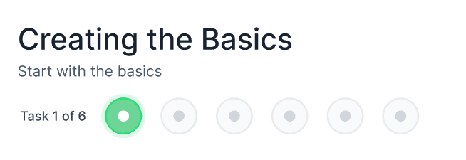
Progress Step
Bar
The initial screen for this project provided only "Step 1". Users would not have any idea on how long the process could be.
Providing a progress step bar establishes a tangible finish line. Furthermore, the Goal Gradient Effect is enforced automatically; and shows that users are more likely to have the motivation to complete the task the closer they are to finishing it.

PAST ITERATION
Old Progress Step Bar
I initially wanted a more compact design with the step bar.
However I scrapped this design because it does not elaborate the future steps the user will take.
A preview project card on the screen that scrolls with the user.
The user now has accurate and responsive feedback on how their changes impact how the card will look on the front page.
This feature aims to boost user confidence and allows for much quicker iterations from the user when on the same screen as the form.
PAST ITERATION
Project Card Preview CTA
I initially chose to provide a button that could preview the card with an overlay. However, I took Doherty's Threshold in mind to increase productivity and attention and thus completion rate.
Finding and clicking on the "Card Preview" button results in longer progress AND requires multiple clicks to preview and leave the preview.
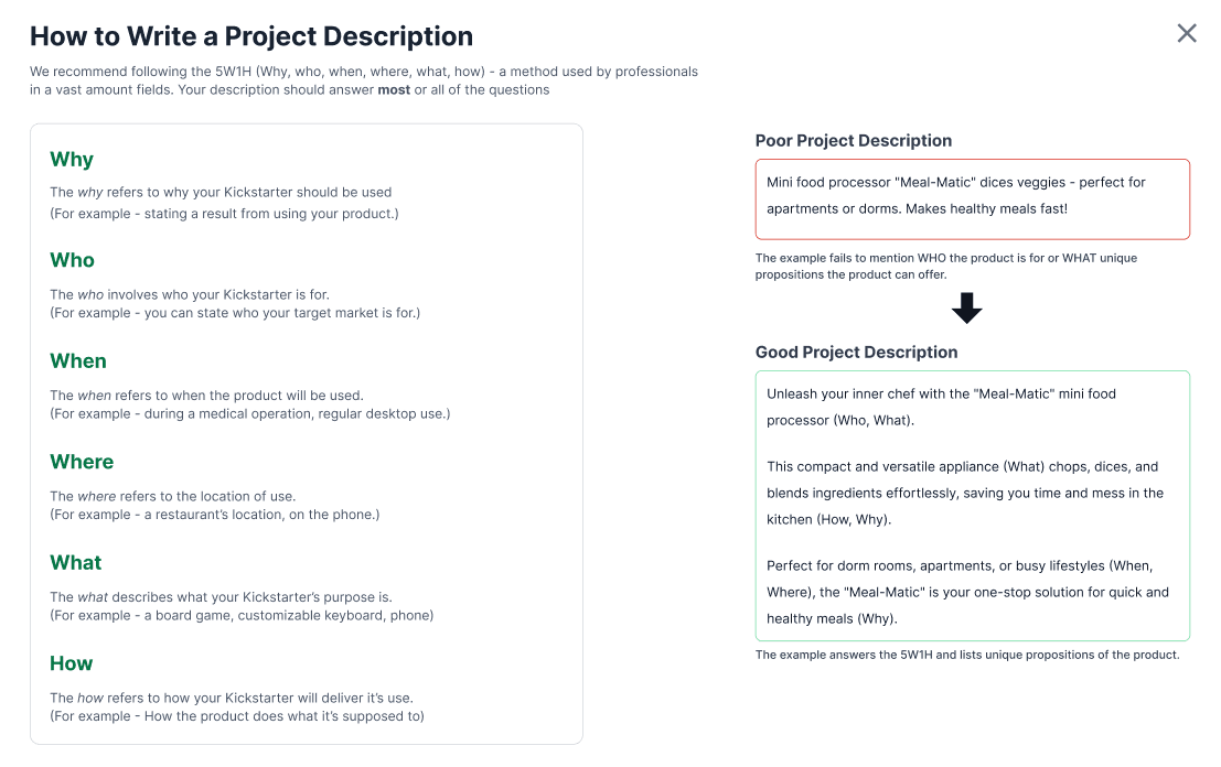
Clicking on green links on the page provides users with two options.
A link to a video to act as a visual guide for pictures.
An overlay providing material for fields based on text.
I chose to incorporate the 5W1H method as teaching material for the project description; as it is a widely used framework for product design.
Header Redesign
I changed the header to be more reflective of the current Kickstarter design.
Removing avenues of distraction and escape results in users paying more attention to components related only to the Kickstarter.
Design
I jumped into creating Hi-Fidelity mockup and interactable prototype. I made small changes such as spacing as needed. The project already provided a viewport and a layout of the required fields, eliminating the need for Lo-Fi and Mid-Fi Wireframes.
I formed the interactable prototype in Figma.
A look into some of the nuances of the redesign. Most choices were designed to be small quality of life changes to reduce uncertainty.
CTA Changes
Changes in color that indicate whether changes have occurred.
Intended to prevent accidental edits and inform the user of change.
Giving Feedback
Notifies and confirms to the user that their changes are being saved.
I chose 120ms between "Saving" to "Inactive" state to give users time to notice and falls under the Doherty Threshold of <400ms to look responsive.
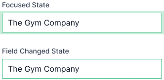
Field Changes
Kickstarter pages feature many editable fields which may result in users forgetting what they changed.
I added a color to indicate the field was edited. A focused state was added to differentiate the field users are on.
Before and After
A look at the Before and After of the design.
Reflections
Thank you for reading! I'm glad to have been a part of this design contest. Redesigning a page without user feedback proved to be a challenge - because, I had to make so many assumptions. The contest had a deadline of two weeks so I wasn't able to perform in-depth testing.
If I had more time I would…
Perform usability tests. The deadline being short meant I wasn't able to recruit people in order to identify any crucial UX problems.
Reiterate more components. I didn't have much time to explore reiterations. However, I would have ideated on other ways to implement the project preview card besides being a sticky scroll component.
Learnings
Aligning design assumptions. Having meager user feedback meant my assumptions in design had to be rooted with current UX and UI designs. I learned not to overstep into maximalism style designs.
Takeaways
Interaction Design with Motion. Incorporating motion and changes in components states to convey an action is a new skill I would like to improve on. This project forced me to learn IxD and motion interactions - which took up MOST of the project time.