Google Developer Groups: Website Redesign
Background
Google Developer Groups are a community of developers interested in working with the company's products. In late 2023, Vancouver's branch wanted to grow the community.
Contributions
As a group - our end goal was developing internal use deliverables such as wireframes and a styling guide.
My primary contribution was developing the hi-fidelity prototype of the Event Details and Mentorship page.
CLIENT
Google Developer
Groups: Vancouver
TEAM SIZE
3 UX Designers
1 Project Manager
1 Developer
TIMELINE
Jan 24' - Ongoing
DELIVERABLES
Website
(Under Development)
Problem and Deliverables
A summary of the problem and the deliverables.
Problem
GDG Vancouver needed a group of volunteers to design and create their brand new website to act as a marketing tool but, didn't have the time or monetary resources.
Their previous website suffered from inconsistent, outdated, and unresponsive design.
Deliverables
We created internal use deliverables such as a styling guide, documentation, and wireframes.
Our front facing deliverable is the prototype for GDG Vancouver's website.
The website is currently under development but, some elements are present as proof of work.
Process and Scope
A quick rundown of our team's working process and project scope.
Work Process
The entire design process was done remotely.
We were introduced to each other via Discord from one of the founders of Google Developer Groups: Vancouver.
We met on a weekly basis to review progress, provide in-depth support, and to give feedback.
Having a private Discord channel allowed us to an easy avenue to communicate with each other, stakeholders, and developers.

Defining Project Scope
Our group was brought on board after previous tasks were completed. The parameters of our project were primarily fixated UX/UI Design and Visual Design. We established a project scope to prevent shifting focus away from our duties.
Finished Tasks
User Research
Site Map
User Flows
Information Architecture
Logo Design
Project Scope
Mood Boards
Low-Fi Wireframe
Styling Guide
Hi-Fi Prototype
Developer Handoff
Ideation
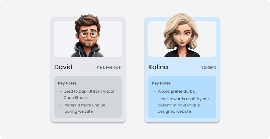
My team was brought on board during the ideation stage. Prior research and tasks had already been completed by a previous team. Our project head gave us complete autonomy but, wanted our website to stand out from other Google Developer Groups websites.
We analyzed the original website and identified elements we thought went against the Aesthetic Usability Effect.
Our group concluded the primary problems related to spacing and accessibility problems such as text being too small.
We analyzed the original website and identified elements we thought went against the Aesthetic Usability Effect.
Our group concluded the primary problems related to spacing and accessibility problems such as text being too small.
We formed moodboards to act as references for our design language, noting various aspects we liked such as colors, elements, and fonts.
The moodboards eventually acted as guidance towards developing our internal use styling guide.

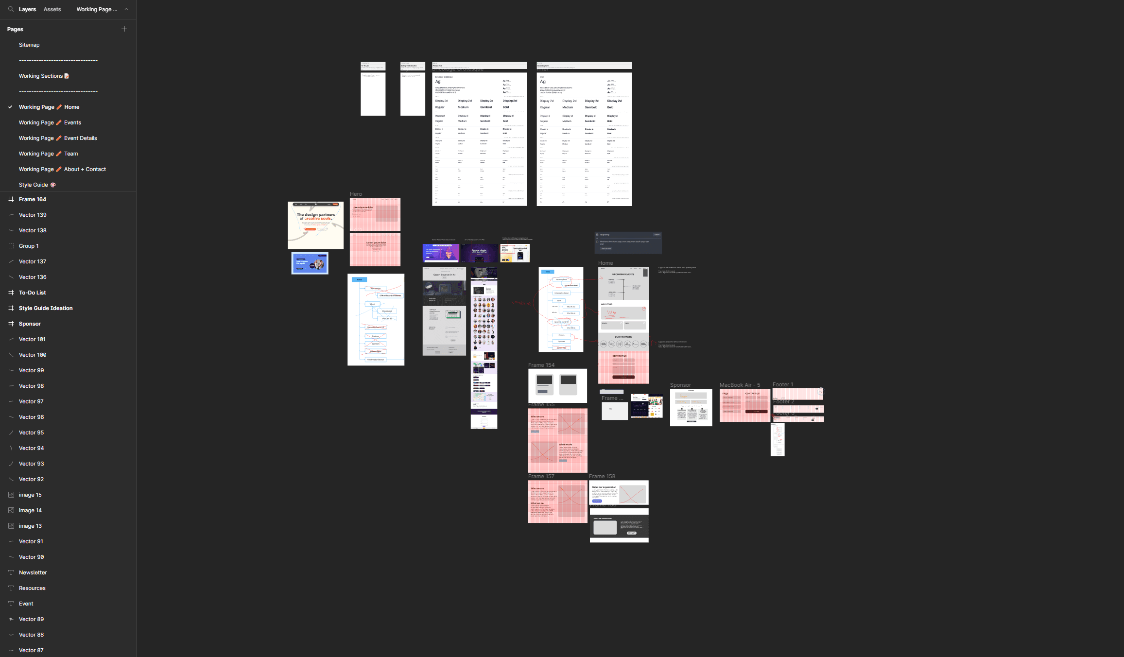
Low Fidelity Wireframes were used to to for multiple ideas for a webpage. We chose aspects we liked from each other's wireframes and reiterated on a final wireframe for a given website.
As a team of three Junior UX Designers, we lacked a lot of real world experience.
Being a remote and bona fide project, our biggest problem was communication; we faced long response times from our stakeholders as they were busy with their primary paying job.
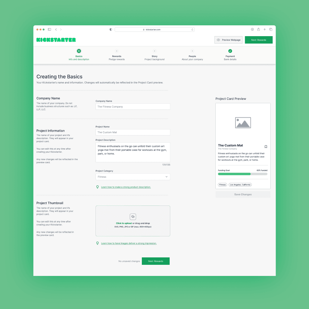
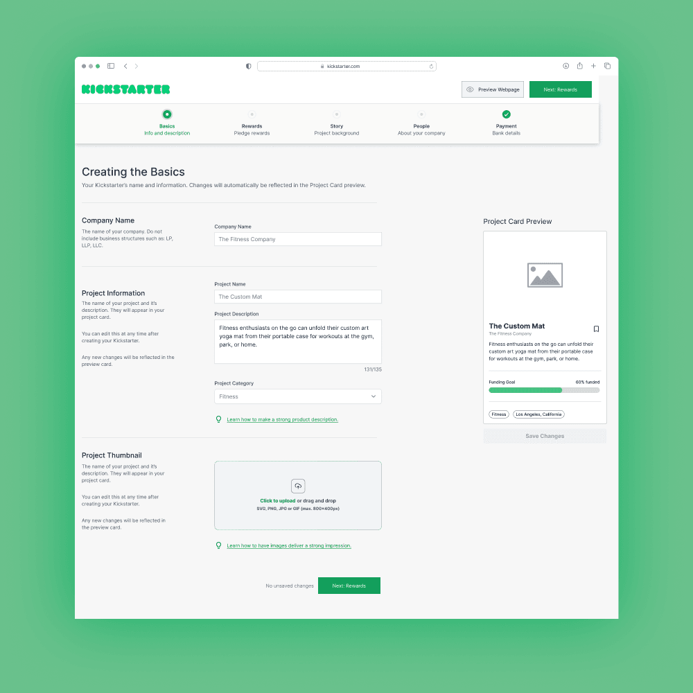
Visual Design and Prototyping
Once we secured approval from developer and stakeholders, we moved on to developing the Hi-Fidelity prototype based on our Lo-Fi Wireframes. Along the way, we also ended up reiterating on design language and even the layouts.
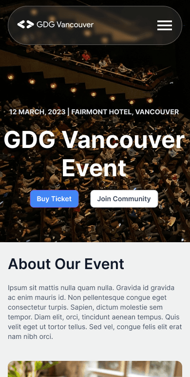
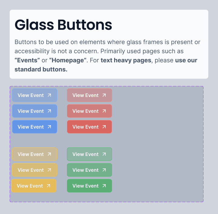
My team, developers and stakeholders finalized our design language and prototypes to primarily focus on a colored glassmorphism theme.
Some of our pages did not heavily incorporate the glass theme to ensure good accessibility and readability.
A look on how our visual design evolved. We experimented with different styles on a whim.
PAST ITERATION • 01
Flat Design
We started with and scrapped this design for being unresponsive due to the nav bar - and lack of visual punch.
Pros
Side navigation bar always there.
Easy to find social buttons.
Cons
Not a unique design
Layout not friendly outside viewport due to navbar and content colors.
PAST ITERATION • 02
Monochrome Glass
We iterated from this design and added Google colors after speaking with our stakeholders and devs.
Pros
Visually beautiful.
Stands out from other GDGs.
Cons
Requires multiple tokens.
Difficult to understand workings for future designers.
Token and Style Formation
Inconsistent styling is a major issue we faced through development. Too many font sizes, colors, and spacing would result in long developing times and more reiteration.
As Juniors, we were introduced to the concept of developing tokens to ease our workload - and the developers.

Documentation
Our time at GDG: Vancouver is temporarily however; we knew that future UX Designers would join the team.
We provided documentation to ensure that future iterations have context and guidance on our design language.
Developer Handoff
We moved into the developer handoff stage after completing internal use deliverables. Our stakeholders chose the webpages for the MVP, giving us time to learn developer handoff practices without overwhelming ourselves.
Annotation
We prepared for handoff by using Figma plugins and kits to annotate elements such as spacing.

Shipping the Design
We performed handoff by creating a Figma page with a working prototype and annotated frames.
At the time of handoff, Zeplin was not free - however, we would use Zeplin if available at that moment.
Post Launch
A look into our next steps while our developers work on producing the website.
Even after shipping the MVP, our group remains fixated on working off our MVP deliverables to improve the visuals and any issues we might come across based on the feedback of users.
Reflections
Thank you for reading! As my UX skills continue to grow, so did my process and time optimization.
Learnings
Reiteration is good! Our glassmorpphism theme was formed from a rapid reiteration. Once our team saw the glassmorphism design, we pivoted towards the new design language.
Less is Faster. Cutting down on number of font sizes, components, ect — as a result, we faced much quicker reiterations and design choices when we were constrained.
Takeaways
Stakeholder communication. Constant talks with stakeholders to ensure their vision is aligned with our skill level to avoid unrealistic expectations.
Developer communication. Communicating with developers is important to process; as it allows us to define constraints that makes the design realistic and practical.