Twitch Stream Schedule

Twitch Stream Schedule

A redesign to consolidate Followed Channels and upcoming streams into one page.

Client

Client

Twitch

Twitch

Team & Role

Team & Role

Solo Product Designer

Solo Product Designer

Timeline

Timeline

April 2024 - May 2024

April 2024 - May 2024

As someone who always uses Twitch, I found the stream schedule lacking…

As someone who always uses Twitch, I found the stream schedule lacking…

Twitch's stream schedule always felt clunky and unintuitive to me. I wanted to validate my thoughts and set out to find if a redesign was necessary.

Twitch's stream schedule always felt clunky and unintuitive to me. I wanted to validate my thoughts and set out to find if a redesign was necessary.

SUMMARY

Out of six users I interviewed…

0% of Interviewees Used Twitch's Schedule

0% of Interviewees Used Twitch's Schedule

They would rather use Discord or Twitter for stream start times. But why?

What are the problems?

Through user feedback, I found three key frustrations.

Through user feedback, I found three key frustrations.

Findability

Findability

The feature is hidden behind a long time consuming process that must be repeated all channels.

Cognitive Overload

Cognitive Overload

High amounts of unrelated data results in long time to process the information to the user.

Readability

Readability

Elements don't align with timetables and poor visual hierarchy make it hard to read.


Elements don't align with timetables and poor visual hierarchy make it hard to read.

Elements don't align with timetables and poor visual hierarchy make it hard to read

Final Results

I performed A/B testing to compare my concept to Twitch; my concept was preferred over Twitch's.

I performed A/B testing to compare my concept to Twitch; my concept was preferred over Twitch's.

0%

Prefer Twitch's solution

100%

Prefer the new concept

USER RESEARCH

0% of interviewees use Twitch's Stream Schedule

0% of interviewees use Twitch's Stream Schedule

First, I needed to determine if a redesign was needed;The process started by remotely interviewed six users who previously used the stream schedule.

First, I needed to determine if a redesign was needed;The process started by remotely interviewed six users who previously used the stream schedule.

Why is a redesign needed?

Why is a redesign needed?

Stream schedules increase likelihood of a user catching a stream and staying engaged on Twitch. The 0% use means Twitch loses revenue. Currently, users find streams on other platforms.

Stream schedules increase likelihood of a user catching a stream and staying engaged on Twitch. The 0% use means Twitch loses revenue. Currently, users find streams on other platforms.

Summary of user opinions.

Summary of frustrations

Summary of frustrations

Based on the data I gathered, I divided their frustrations into two problem categories: compounding UX problems and a failure to meet their needs.

In the next section, I'll delve into the specifics of the problems to illustrate where and why there is a problem.

Based on the data I gathered, I divided their frustrations into two problem categories: compounding UX problems and a failure to meet their needs.

In the next section, I'll delve into the specifics of the problems to illustrate where and why there is a problem.

PROBLEM 01

Compounding UX Problems

Compounding UX Problems

Cognitive overload from unnecessary data.

Cognitive overload from unnecessary data.

Accessing the feature is both, difficult and time consuming.

Accessing the feature is both, difficult and time consuming.

The schedule is difficult to read and interpret.

The schedule is difficult to read and interpret.

PROBLEM 02

Failure to meet user needs

Failure to meet user needs

Users need a consolidated schedule for all their Followed Channels.

Users need a consolidated schedule for all their Followed Channels.

Users need to see all streams starting for the day.

Users need to see all streams starting for the day.

PROBLEM DEFINING

Defining the frustrations

Defining the frustrations

During the remote interviews, the interviewees screenshared to provide an in-depth analysis of the frustrations. I also gathered feedback and ideas to guide my design iterations.

During the remote interviews, the interviewees screenshared to provide an in-depth analysis of the frustrations. I also gathered feedback and ideas to guide my design iterations.

Poor findability and time on task

Poor findability and time on task

On average it takes 7 to 13 seconds to reach the schedule page. The process needs to be repeated for each schedule a user wants to view.

Cognitive Overload

Cognitive Overload

Data unrelated to schedule start times adds cognitive load. I found the data interviewees only need are:

Data unrelated to schedule start times adds cognitive load. I found the data interviewees only need are:

Starting Time

Starting Time

Date

Date

Channel Name

Game Name

Game Name

Necessary elements highlighted.

Poor visual and readability

Poor visual and readability

Time headers don't lineup with elements, making it difficult to interpret when streams start.


Small font size and spacing between elements make reading text difficult.

Time headers don't lineup with elements, making it difficult to interpret when streams start.

Small font size and spacing between elements make reading text difficult.

Failure to meet user needs

Failure to meet user needs

Users find the process of going through each channel to find the schedule inefficient and makes data hard to recall. They say they need to have their Followed Channels consolidated into one schedule.

Users find the process of going through each channel to find the schedule inefficient and makes data hard to recall. They say they need to have their Followed Channels consolidated into one schedule.

IDEATION AND REITERATION

IDEATION AND REITERATION

Creating an all-in-one schedule for users

Creating an all-in-one schedule for users

Users spend the most time watching streams on Twitch. As a result, I went for a simplistic design prioritizing function over visuals. Throughout the process, I reiterated on elements.

Improve Findability

Improve Findability

I chose to experiment with feature placement in two locations. Initially, I placed it in the icon cluster to save space but found it doesn't relate to finding streams. Instead, I implemented the feature into the text links as it better relates to finding streams.

Content Card

Content Card

I redesigned the card based on interviews to allow a user to easily identify who is streaming, what is being streamed, and when the stream starts.

Finding the best way to layout streams

Finding the best way to layout streams

The next challenge was to find the best way to layout content cards. I opted for the panel to be vertical panel due to being easier to scroll though with a scrollbar.

The next challenge was to find the best way to layout content cards. I opted for the panel to be vertical panel due to being easier to scroll though with a scrollbar.

Stream Schedule

Stream Schedule

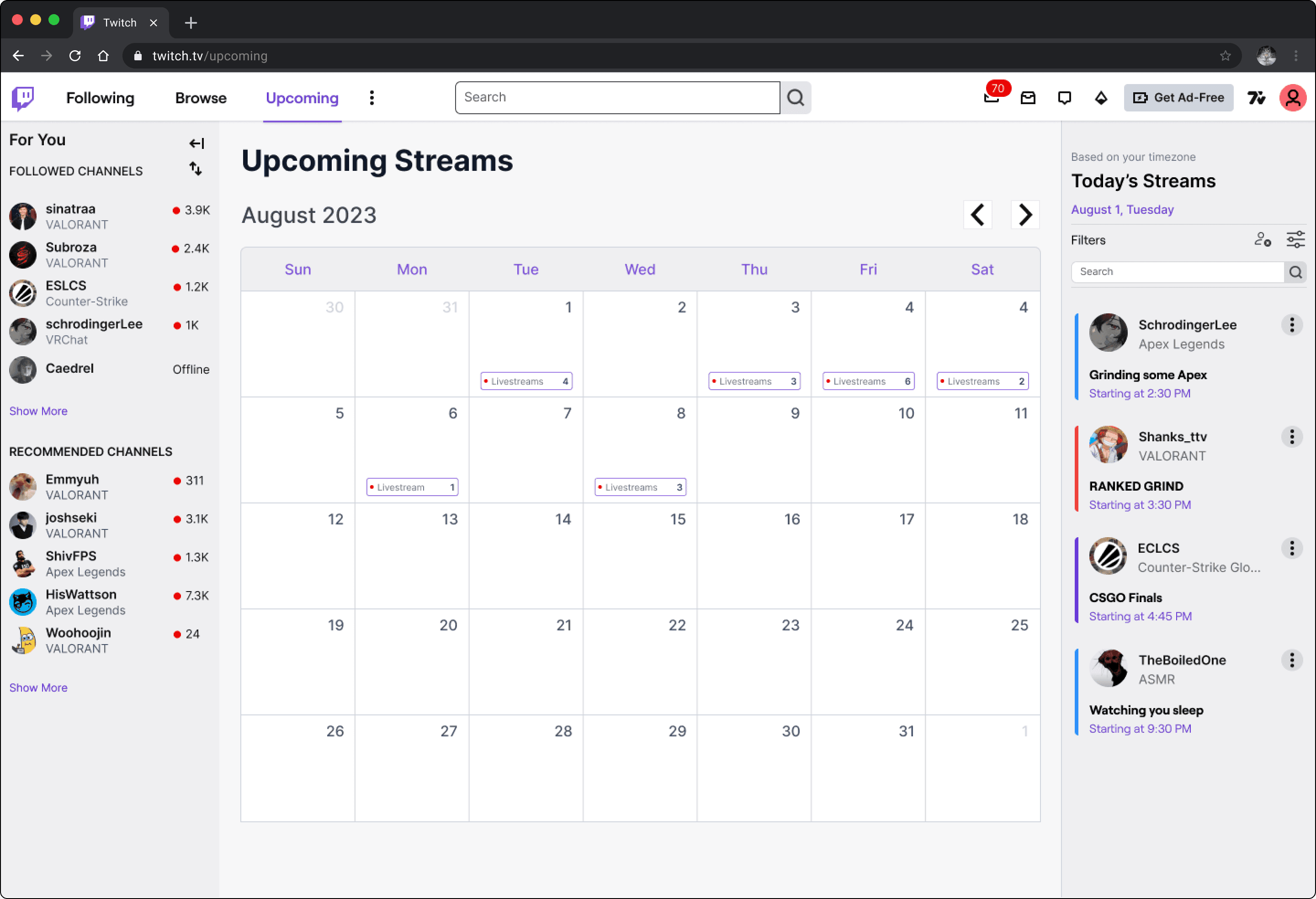
The calendar features the number of livestreams in a date cell. Removing the time headers resulted in less confusion. Now, users see the exact starting times of Followed Channels chronologically.

The calendar features the number of livestreams in a date cell. Removing the time headers resulted in less confusion. Now, users see the exact starting times of Followed Channels chronologically.

▼ FINAL SOLUTION ▼

▼ FINAL SOLUTION ▼

An all-in-one schedule

An all-in-one schedule

Welcome to the Upcoming Streams schedule

You'll never lose track of streams ever again. Everyone you follow is now in one page - complete with number of streams starting that day!

USER TESTING

Validating the efficacy of the solution

Validating the efficacy of the solution

Ideally, I would test this this solution with Twitch's API to find problems and edge cases. Instead, I did A/B testing with a few users — to compare Twitch's solution vs the concept with a prototype.

Ideally, I would test this this solution with Twitch's API to find problems and edge cases. Instead, I did A/B testing with a few users — to compare Twitch's solution vs the concept with a prototype.

Current Solution vs Concept

Current Solution vs Concept

The concept was met to critical acclaim by users. Users found the concept easier to interpret while being much faster to access. Overall, they preferred the concept by far.

0%

Prefer Twitch's solution

100%

Prefer the new concept

User Feedback

User Feedback

Due to time constraints, the prototype was created for minimum viability. Knowing this, I gathered user feedback to identify crucial features if the product was developed.

Participant 1

Maybe you can add a timetable view like a Channel guide?

Participant 2

It might not be useful but, what about adding non followed channels?

CONCLUSION

Project Reflections

Project Reflections

Thank you for reading! Here's a few things I learned and some takeaways!

Accepting UI/UX doesn't have to be so glamorous

Accepting UI/UX doesn't have to be so glamorous

My initial problem with this project was the lack of visual punch. However, it's important to note the main point of the feature is to redirect users to streams - the core function of Twitch.

My initial problem with this project was the lack of visual punch. However, it's important to note the main point of the feature is to redirect users to streams - the core function of Twitch.

Human Factors is very important

When creating a solution

When creating a solution

Working without user testing

Contest deadline meant no time for testing. This shaped my design philosophy into making small changes that are easily reversible should user feedback be negative.

Contest deadline meant no time for testing. This shaped my design philosophy into making small changes that are easily reversible should user feedback be negative.

VIEW THE NEXT PROJECT