Home
>
Works
>
Kickstarter Case Study
Case Study
Case Study
Introduction
Introduction
Kickstarter: Project Creation Redesign
Kickstarter: Project Creation Redesign
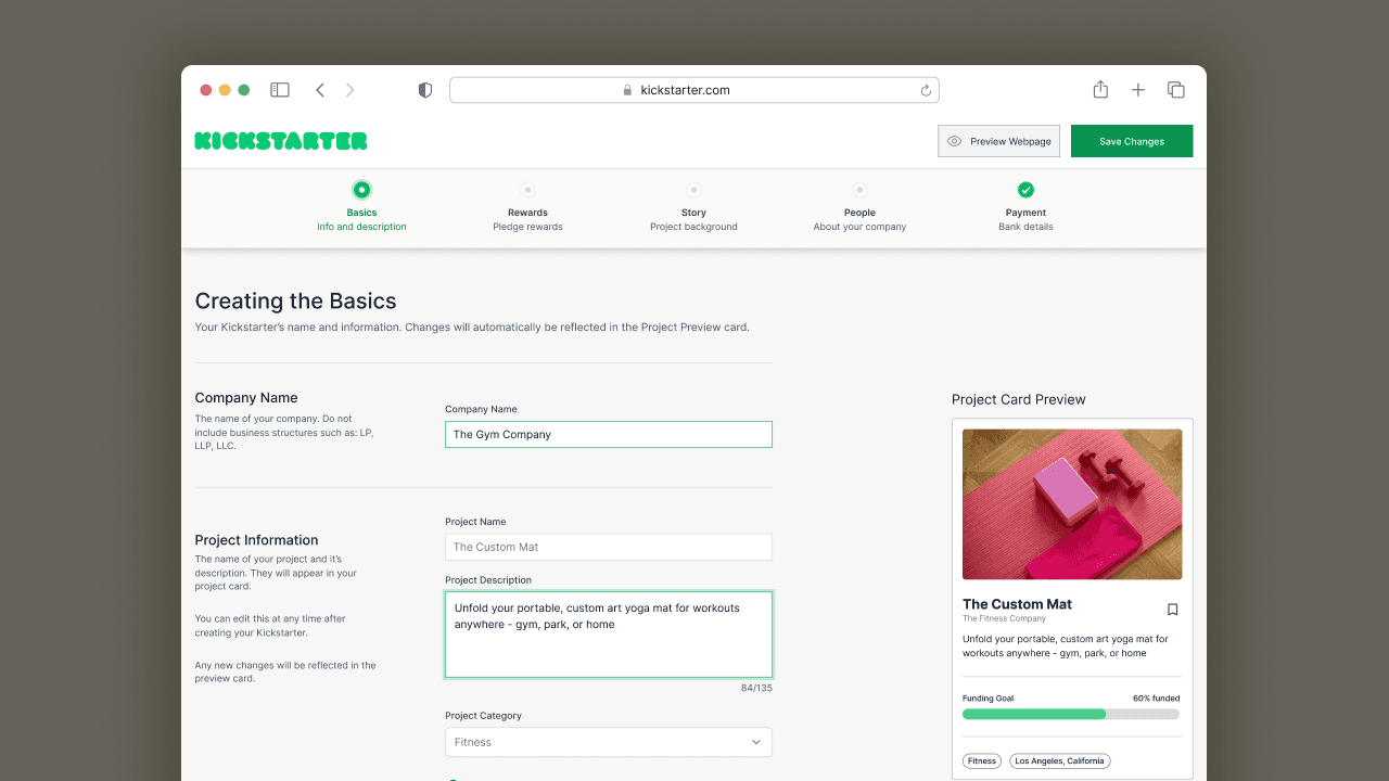
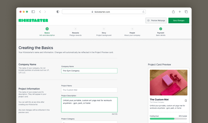
A redesigned project creation page implementing user experience practices, heuristics, and psychology to reduce the page drop-off rate.
Nominated as a finalist for the Kickstarter redesign contest under Fia Reyes!
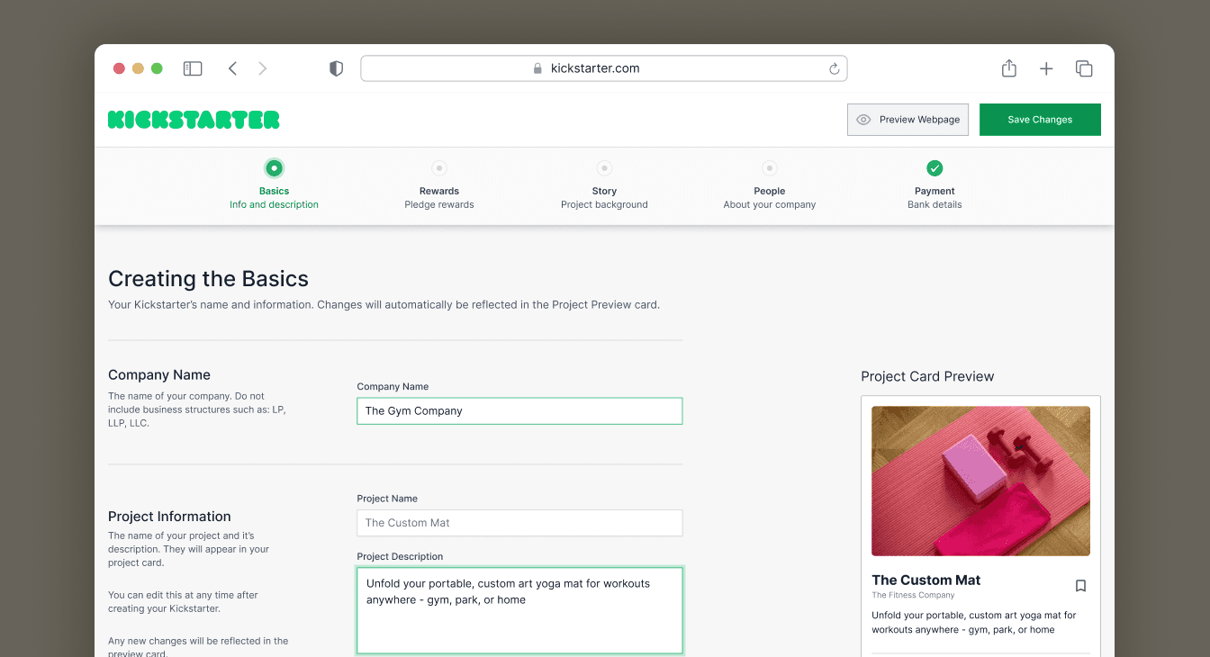
A redesigned project creation page implementing user experience practices, heuristics, and psychology to reduce the page drop-off rate.
Nominated as a finalist for the Kickstarter redesign contest under Fia Reyes!
Project Background
This project is part of Bitesize's Kickstarter Redesign Contest. I entered the test and hone to gauge my skills compared to the competition.
I redesigned the Kickstarter page to conform to good UX Practices and psychology to reduce the drop-off rate of the creation page.
Project Background
This project is part of Bitesize's Kickstarter Redesign Contest. I entered the test and hone to gauge my skills compared to the competition.
I redesigned the Kickstarter page to conform to good UX Practices. I also used psychology and heuristics to improve the interaction.
Project Information
Client
Kickstarter
Team & Role
Solo UX Designer
Timeline
March 24' (2 Weeks)
Deliverables
Prototype
Project Information
Client
Kickstarter
Team & Role
Solo UX Designer
Timeline
March 24' (2 Weeks)
Deliverables
Prototype
Before and After (Summary)
Before and After (Summary)
The Problem
The Problem
Understanding the problem and forming project goals.
Understanding the problem and forming project goals.
Defining the Problem and Setting Goals
Defining the Problem and Setting Goals
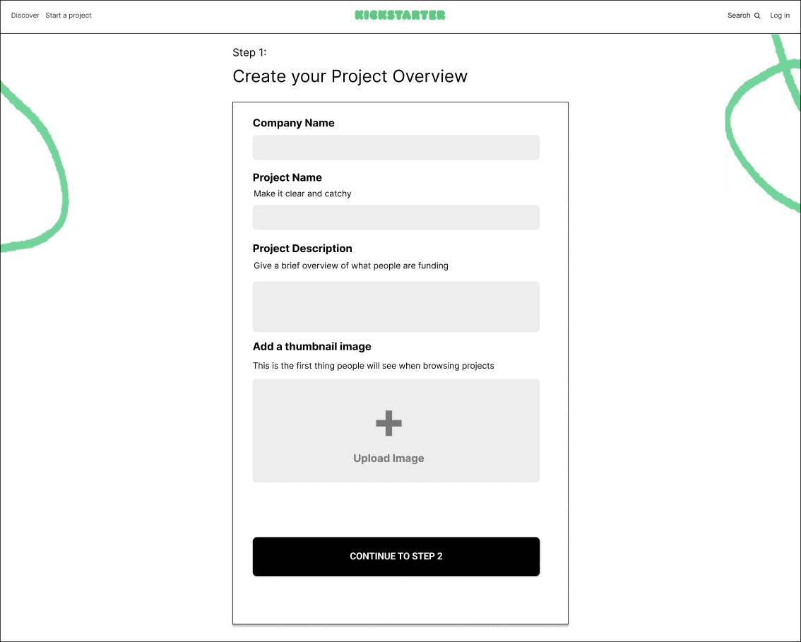


Users abandon the process upon seeing the screen.
Users abandon the process upon seeing the screen.
The Problem
The Problem
Kickstarter is seeing a high drop-off on the first step of the project creation screen. I was tasked with redesigning the screen to reduce drop-off.
Kickstarter is seeing a huge drop-off on the first step of the project creation screen. Users abandon the process upon seeing the screen above. I was tasked with improving the screen based on user feedback to reduce drop-off.
Project Goals
Project Goals
Analyze negative user feedback.
Uncover UI/UX and Human Factors problems.
Uncover UI/UX and Human Factors problems.
Redesign the experience based on feedback and the uncovered problems.
Project Constraints
Defining Constraints
Redesign is based on contest project parameters; not current Kickstarter.
Based on desktop only.
User Feedback was provided to me.
Project Constraints
Defining Constraints
Redesign is based on contest project parameters; not current Kickstarter.
Based on desktop only.
User Feedback was provided to me.
Research
Research
Analysis on the current experience to determine WHY users drop off.
Analysis on the current experience to determine WHY users drop off.
User Feedback
Beginning the process
I began by examining the user feedback due to being tangible information.
Why do Kickstarter creators experience frustrations?
A lack of clear preview of how their project card will appear on the platform.
They need direction on titles, descriptions, and images to deliver a strong first impression.
Uncertainty on the ability to edit project details and image pre & post launch.
UX/UI Contributors to Drop-Off
UX/UI Contributors to Drop-Off
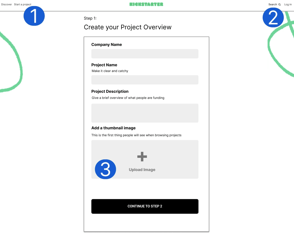


Elements contributing to drop-off
Elements contributing to drop-off
Header links provide options to leave the page.
Header links provide options to leave the page.
Element shapes lead users away from the form and towards header links.
Element shapes lead users away from the form and towards header links.
No recommended guidelines for fields such as Image Upload.
No recommended guidelines for fields such as Image Upload.
Interaction Problems
Analyzing the interaction holistically
I identified implicit problems that could contribute to drop-off.
No way to jump around steps. A linear project creation process can overwhelm users, who may be ideating on certain fields.
Must be completed in one sitting? No words such as "Save Changes" imply to that the process must be completed in one sitting.
Boredom. A long and monotonous creation process might lead to drop-off.
Problem Refining
Determining the problem and creating goals to resolve drop-off.
Problem Refining
Determining the problem and creating goals to resolve drop-off.
The Final Problem and Goals
How can we increase task completion rate based on the user feedback of the current experience?
User feedback states that creators require guidance and visual feedback to solve their frustrations. The current user interface reveals UI elements that can also contribute to a lower task completion rate.
Redesign Goals
Remove elements that detract the user from completing the form.
Add elements that resolve the user feedback frustrations.
Enhance the experience with practices encouraging task completion.
Ideation
I assumed long forms bored users into drop off; so applied visual changes and psychology to enhance the experience.
Ideation
I assumed long forms bored users into drop off; so applied visual changes and psychology to enhance the experience.
— Visual Design Ideation —
— Visual Design Ideation —
Project Card Preview
Project Card Preview
Real Time Card Preview
Real Time Card Preview
Provides instant visual feedback to creators for their project card.
Provides instant visual feedback to creators for their project card.
Adding a Progress Bar
Adding a Progress Bar


Progressive Tasks
Progressive Tasks
Divides the form into smaller task to reduce the "overwhelming" feeling of long forms.
Divides the form into smaller task to reduce the "overwhelming" feeling of long forms.
Taking advantage of the Goal Gradient Effect
Taking advantage of the Goal Gradient Effect
Motivates users to complete the task the as they near the final step.
Motivates users to complete the task the as they near the final step.
Overlay with Advice
Overlay with Advice
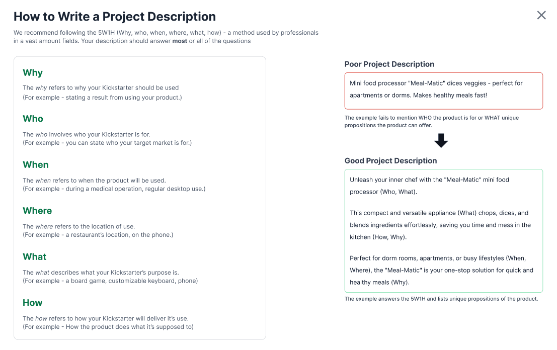
For Users Who Need Guidance
For Users Who Need Guidance
A link provides guidance on professional techniques for strong first impressions.
A link provides guidance on professional techniques for strong first impressions.
Header Redesign
Header Redesign


Removing unnecessary links
Removing unnecessary links
Provides less opportunities for users to leave the form.
— Interaction Design Ideation —
— Interaction Design Ideation —
Informing the user of saving progress.
CTA Changes
Notifies and confirms saved progress, important long forms.
120ms animation to feel responsive. Falls under the Doherty Threshold of <400ms.
Informing the user of saving progress.
CTA Changes
Notifies and confirms to the user that their changes are being saved.
120ms during state transitions to give users time to notice and falls under the Doherty Threshold of <400ms to FEEL responsive.
Knowledge on previously edited and active forms.
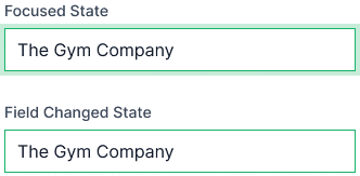
Field States
Many fields results in users forgetting what they edited or where they are.
Inspired by the Von Restorff Effect to isolate specific field types.
Knowledge on previously edited and active forms.

Field States
Many fields can result in users forgetting changed elements.
Previously edited fields have a color stroke, and a focused state differentiates the field currently in use.
Inspired by the Von Restorff Effect to isolate which fields were changed with visual differences to prevent unintended changes.
Final Solution
A experience designed to motivate and help users get started on a Kickstarter.
Final Solution
A experience designed to motivate and help users get started on a Kickstarter.
A Redesigned Form — With a card you can preview changes!
A Redesigned Form — With a card you can preview changes!
Instant Feedback and Preview
Instant Feedback and Preview
See the edits you make in real time so you always know how your project will appear to others. No more wondering if your project will look bad or clicking off the page!
See the edits you make in real time so you always know how your project will appear to others. No more wondering if your project will look bad or clicking off the page!
Clarification
Clarification
Users now know that they can edit their Kickstarter information pre & post creation.
Users now know that they can edit their Kickstarter information pre & post creation.
Need advice? We've got you covered!
Need advice? We've got you covered!
Helping users to form better Kickstarters!
Helping users to form better Kickstarters!
Click on any of the green links to learn what makes a product good! Use tried and true techniques that professionals use in their fields — and apply it to your Kickstarter!
Click on any of the green links to learn what makes a product good! Use tried and true techniques that professionals use in their fields — and apply it to your Kickstarter!
Past Iterations
An example of some elements I chose to scrap BUT, built off or learned from their failed implementation.
Past Iterations
An example of some elements I chose to scrap BUT, built off or learned from their failed implementation.
Past Iteration - Example 01
Old Progress Bar
Initially intended to be a more compact design.
Scrapped give visible names of the steps to improve navigation.
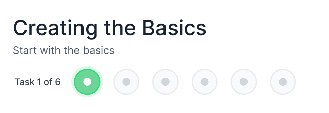
Past Iteration - Example 01
Old Progress Bar
Initially intended to be a more compact design.
Scrapped give visible names of the steps to improve navigation.

Past Iteration - Example 02
Project Card Preview Button
Scrapped when I realized that users would rather see their design updated real time.
Past Iteration - Example 02
Project Card Preview Button
I initially used a design that previews the card with an overlay.
The design was scrapped when I realized that users would rather see their design be updated WHILE filling the form.
Reflections
Thank you for reading!!
This is a look into lessons learned from the project. I also explore into what I could have done different if I had more time.
Reflections
Thank you for reading!!
This is a look into lessons learned from the project. I also explore into what I could have done different if I had more time.
Learnings
Learning to apply assumptions
It was hard working without in-depth research. However, I was able to apply my assumptions into small quality of life changes.
Improving my interaction design
Taking the user feedback and translating it into an interaction design. I learned how to create elements that enhance the interaction rather than a redesign.
What I Would Have Done Differently
Refining the components
After completion of the project, I realized there's no element to minimize the progress bar or hide the preview card on the edge case if the user feels it's too distracting. I now have knowledge on these UX problems for future designs.
Reiterate on Layouts Based on Viewports
A problem I faced was trying to layout the form and elements in perfect position. In hindsight, I did not think about experimenting with viewports to resize elements. In the future, I would do this based on the content of the page.
For this project, I assumed that users were focused on filling the form and did not mind the awkward sizing of the content. But, it's a methodology I would like to implement regardless.
A/B Tests
Two weeks meant I could not recruit people to do in depth user testing. However, I pondered on the idea of doing quick A/B Testing to survey which iteration of a form users liked more.
FIA
WORKS
Thank you for visiting!
Let's work together!
© 2024 Fia - Inspired by the world of NieR:Automata.
This portfolio was designed and built by Fia.

FIA
WORKS
Thank you for visiting!
Let's work together!
© 2024 Fia - Inspired by the world of NieR:Automata.
This portfolio was designed and built by Fia.

FIA
WORKS
Thank you for visiting!
Let's work together!
© 2024 Fia - Inspired by the world of NieR:Automata.
This portfolio was designed and built by Fia.
