
▼ // PRODUCT DESIGN
Kickstarter Project Creation Redesign
Adding signifiers and feedback to reduce cognitive load and drop off.
Motivating myself to improve my UX Design skills
This project is part of Bitesize's Kickstarter Redesign Contest. I participated to see how my skill compares to others. Not affiliated with Kickstarter but, I'll approach this case study from the perspective as a UX Designer for Kickstarter.
▼ // BRIEF AND SUMMARY// ▼

Why I joined a redesign contest -and- how I solved their problem
Competing to Improve My Skills
As a budding designer, I wanted to see how my skills compare to others. Design competitions drive designers to be unique and innovative while solving the problem.

Although I didn't win, I was a finalist and enjoyed improving my skills!
The Challenge
Kickstarter faces high-drop off rate on the screen below. To summate, user feedback revealed the lack of visual feedback, guidance, and clarity regarding post edits.
My task was to redesign the screen to resolve user feedback.
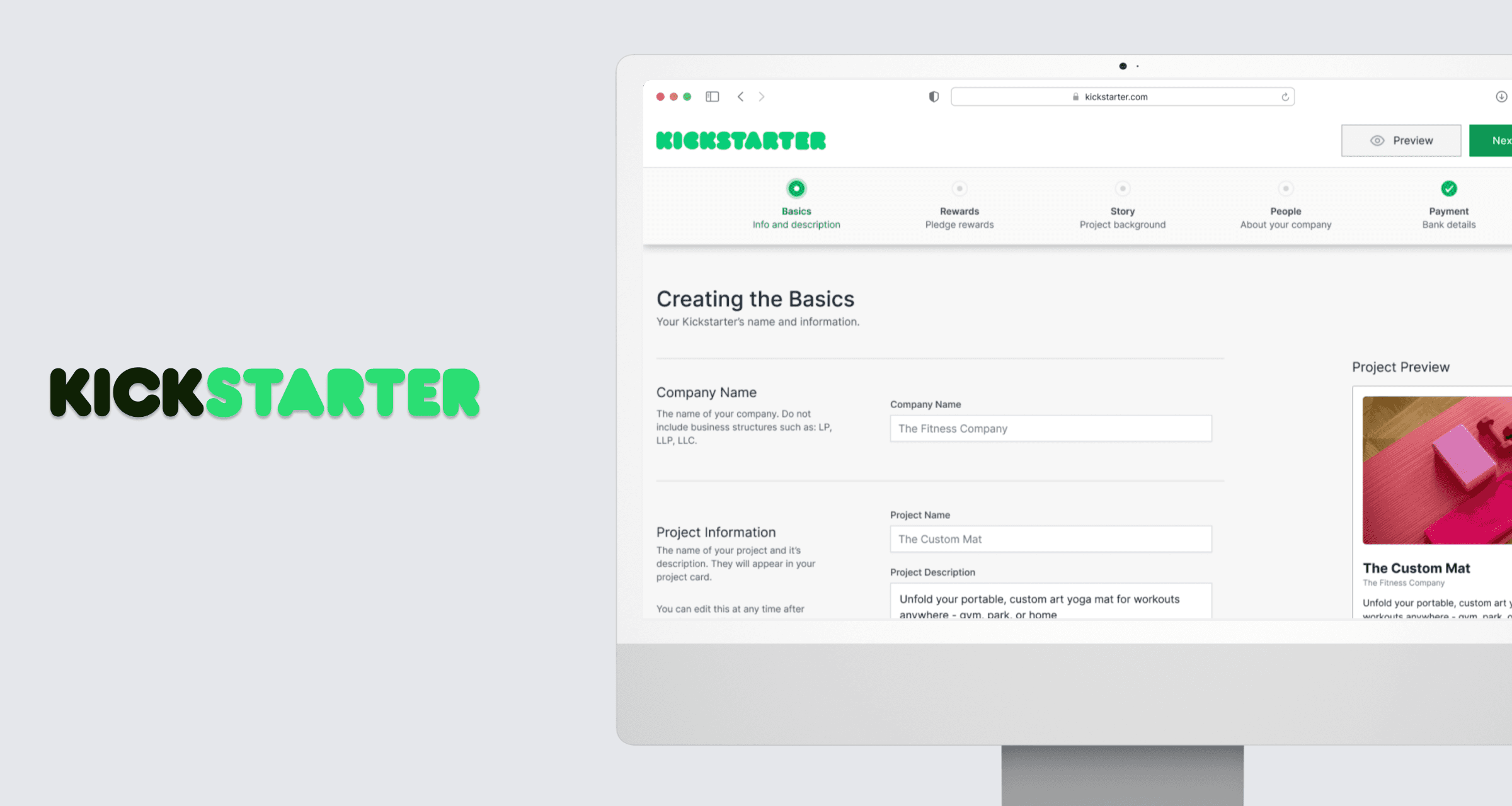
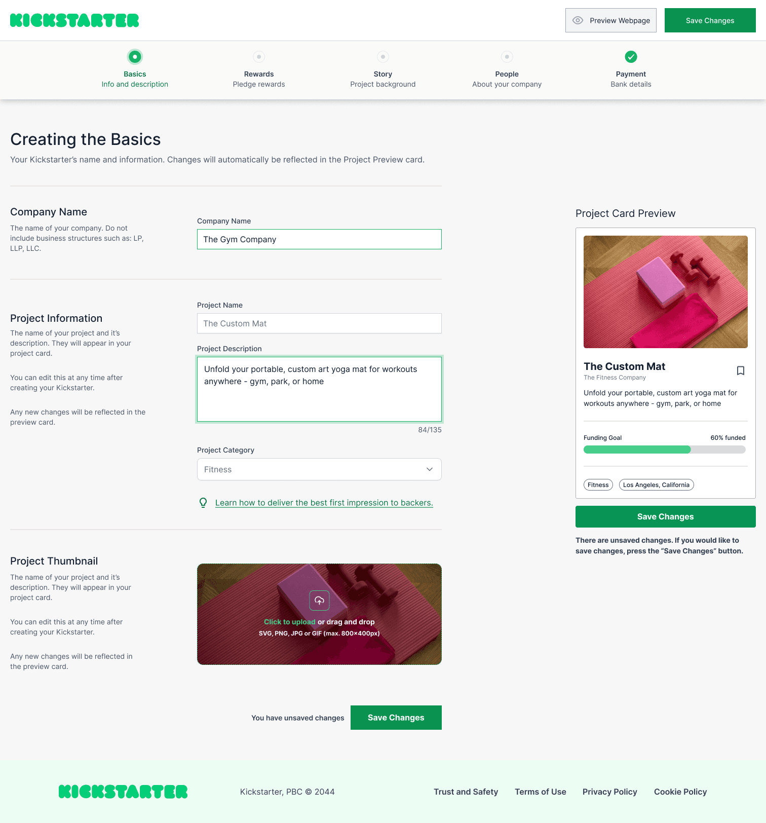
Final Result
My solution focused on the user feedback and providing visual stimulation to reduce drop off.
June 2024 update: I plan on redoing this screen now that my UI skills have improved since the project. I will add a new section while keeping what I have documented.
▼ // PROBLEM DEFINING // PHASE 01
Drop offs are resulting in less projects. Projects are a core foundation of the Kickstarter experience, leading to dropping revenue. As a designer, I transformed the user feedback to a redesign that resolves user problems.
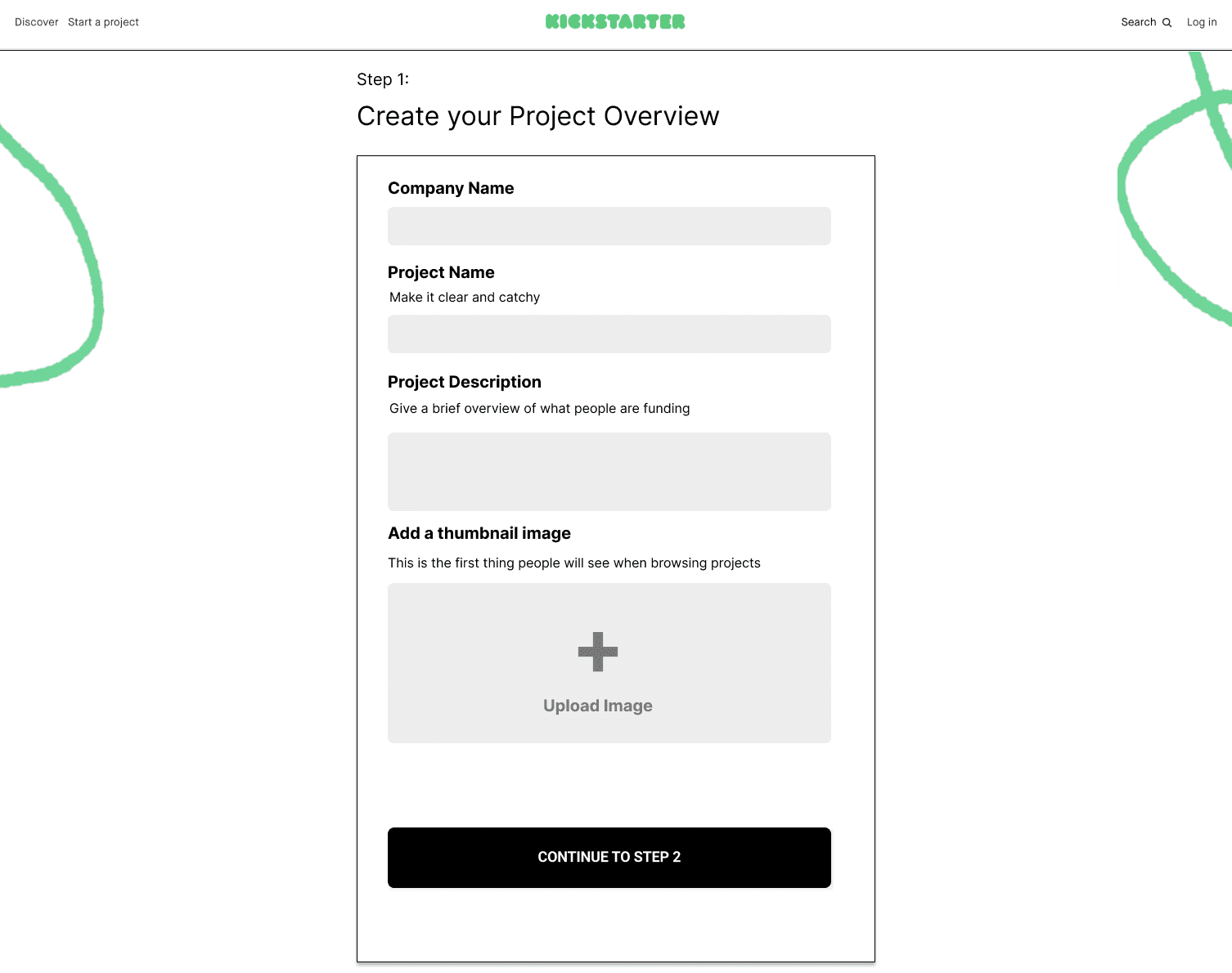
Understanding the current problem
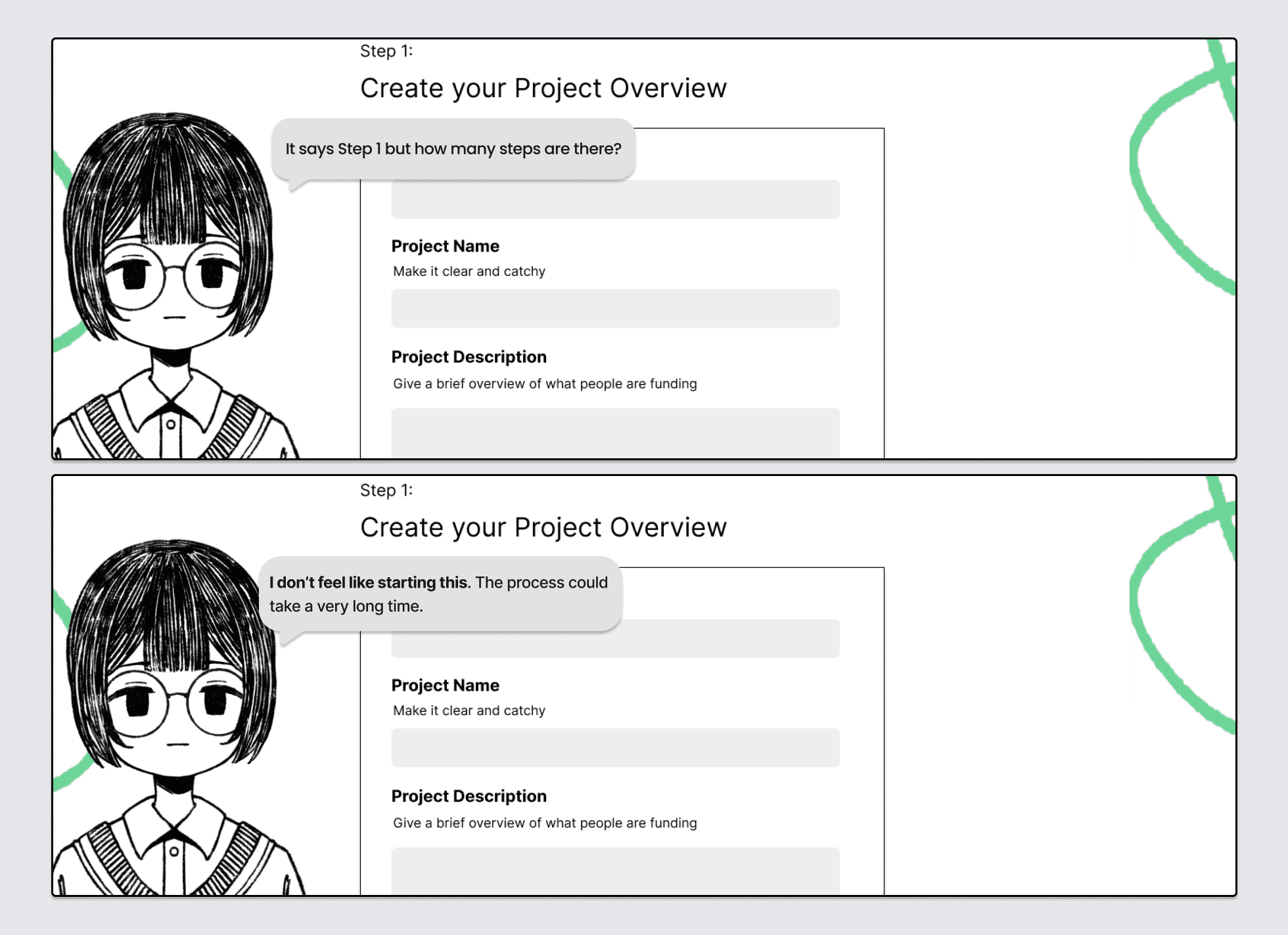
The first step leaves a bad impression on users. After glancing the screen, users feel overwhelmed and confused. I synthesized the user feedback into problems to ideate on.
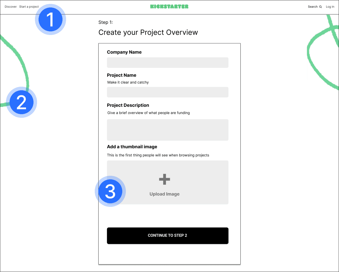
What are users frustrated about?
I looked into other elements that are not in the user feedback but, could contribute to drop-off.
Redesign Challenges
The priority focus should be on resolving user feedback. Secondarily, we can enhance the experience to motivate users to complete the process.
There needs to be elements to reflect the visibility of a user's edits.
Add guidance to prevent the feeling overwhelmed.
Add clarification text to reduce uncertainty.
The core problems users face
▼ // IDEATION // PHASE 02
I chose to redesign the experience to help drop-off AND guide creators to making high quality products. High-quality products attract more backers - in turn assisting the creator and Kickstarter monetarily.
No button or element to showcase how the card will appear on the front-end.
Preview acts as signifier to easily identify mistakes and the card's appearance to backers.
Users find it overwhelming and time consuming to create a project without guidance - leading to drop off. The pop up guides the creator on the 5W1H method; covering most questions that a backer might have.
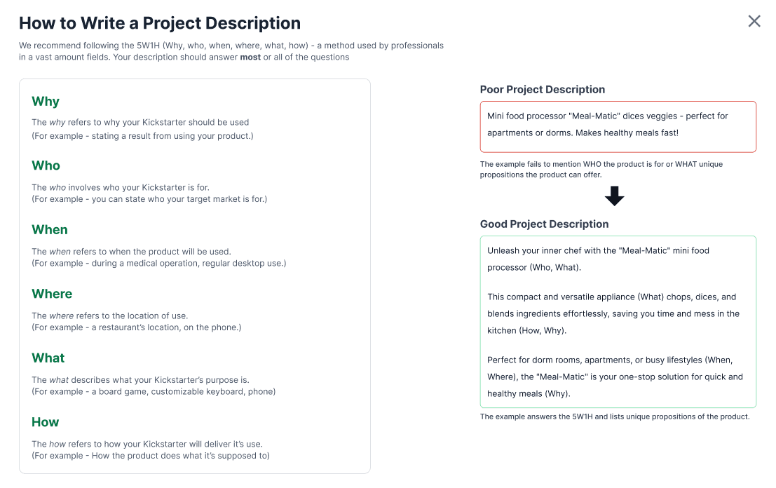
There's a less overwhelming method for Creators with guidance. Backers benefit from more detailed descriptions - making it more likely to back up Creators and Kickstarter.
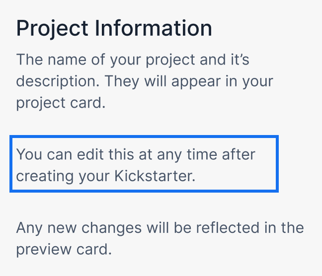
Before, users didn't know if edits could be done post launch - leading to hours of reiterations on text and pictures.
After, users are clarified. The combination of text and card preview reduces hours of reiteration.
INTERACTION DESIGN IDEATION
Although outside the scope of the project — I chose to explore interaction specific ideations that could reduce drop-off. The ideations are rooted in UX practices and psychology.
Adding a Progress Bar
A lack of seeing progress might lead to users questioning how long the process could be. Based on the Goal Gradient Effect, we can increase motivation and task completion rate by adding a visible goal.
Users feel overwhelmed and demotivated seeing a lack of visible progress.

Users feel overwhelmed and demotivated seeing a lack of visible progress.
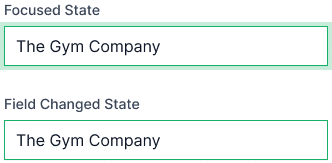
Form creations have a lot of fields making it easy to forget of what was changed.
Adding states lets users remember what they changed to reduce lingering doubts and frustrations.
A lack of a signifier for unsaved progress, could lead to users spending hours of work - only to abandon the process if they forget to save.
Adding signifiers with text and color changes ensures users don't forget to save.
▼ // FINAL SOLUTION // ▼
Welcome to the NEW
See your changes in real time!
View to see how your product will look to backers. You'll spend less time making that perfect image AND find mistakes easier. See what backers will see.
Helping creators design better products
It's overwhelming when you have a blank slate. That's why we're giving you the same advice that professionals in fields use. All in one easy click.
▼ // REFLECTION //
Thank you for reading! Here's a few things I learned and some takeaways!
Reiterate on viewport sizes
At the time, I was inexperienced and didn't about adjusting the viewport based on content. This led to awkward sizing and spacing of components. I keep this in mind now.
Refining the components
After completion, I realized there's no element to minimize the progress bar or hide the preview card. I plan on scrutinizing my work more thoroughly in the future.
Working without user testing
Contest deadline meant no time for testing. This shaped my design philosophy into making small changes that are easily reversible should user feedback be negative.