Home
>
Works
>
Kickstarter Case Study
Case Study
Introduction

Background
This project is part of [REDACTED]
Lorem ipsum dolor sit amet, consectetur adipiscing elit, sed do eiusmod tempor incididunt ut labore et dolore magna aliqua. Ut enim ad minim veniam, quis nostrud exercitation ullamco laboris nisi ut aliquip ex ea commodo consequat.
Project Information
Client
Yahoo
Team & Role
Solo UX Designer
Timeline
March 24' (2 Weeks)
Deliverables
Prototype
Results - Demonstration
Problem
The Problem
Lorem ipsum dolor sit amet, consectetur adipiscing elit, sed do eiusmod tempor incididunt ut labore et dolore magna aliqua. Ut enim ad minim veniam, quis nostrud exercitation ullamco laboris nisi ut aliquip ex ea commodo consequat.
Project Constraints
Lorem ipsum dolor sit amet, consectetur adipiscing elit, sed do eiusmod tempor incididunt ut labore et dolore magna aliqua. Ut enim ad minim veniam, quis nostrud exercitation ullamco laboris nisi ut aliquip ex ea commodo consequat.
Ideation
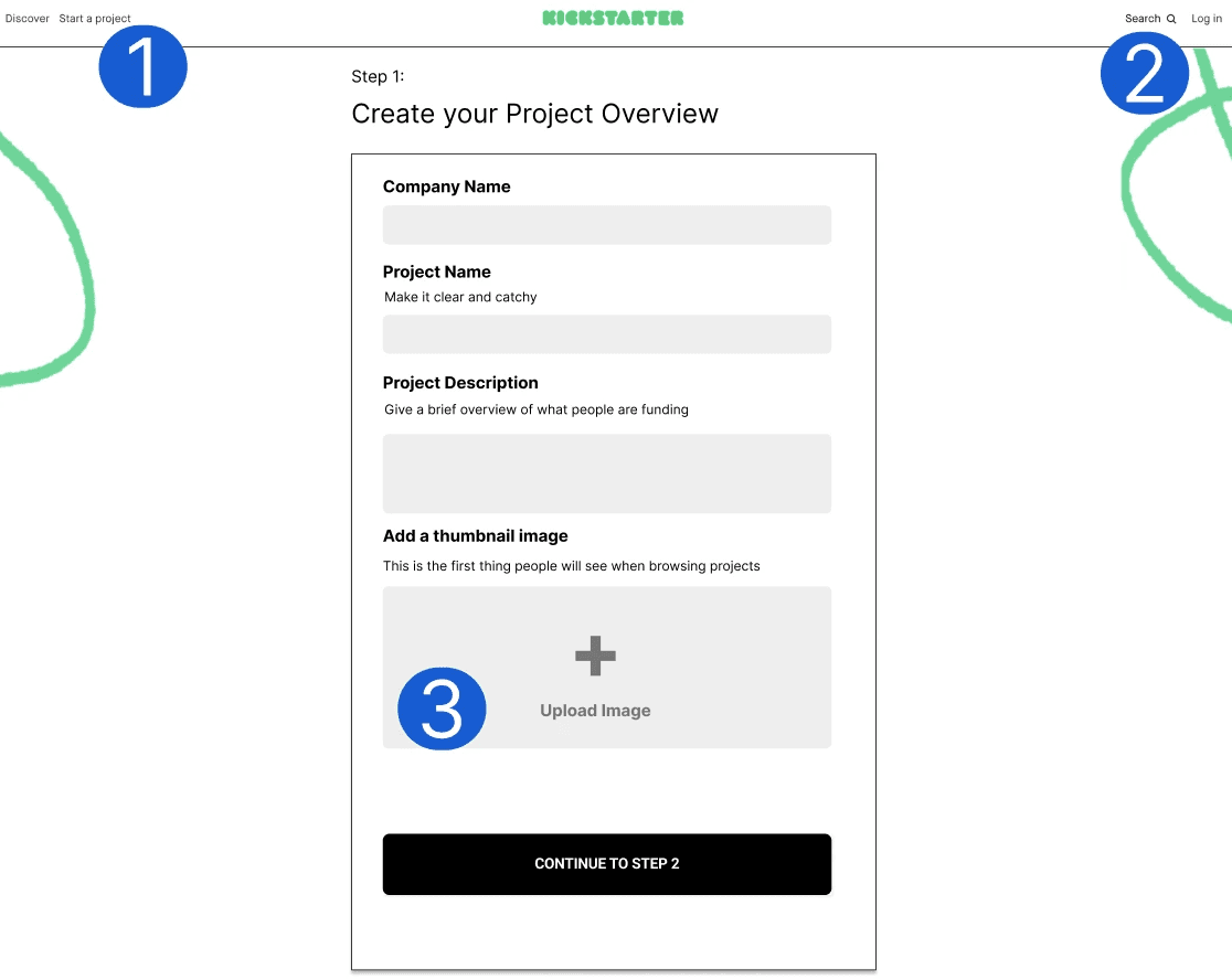
I chose to break down the screen shot of the project to identify possible problems that users might face.
Ideation
I chose to break down screen shot of the project to identify possible problems that users might face.
User Feedback
Examining Frustrations
I first took an in-depth look at the user feedback provided to me to form assumptions.
Why do users experience frustrations?
Creators don’t know what their project card is going to look like when users see it on the front end.
Creators know that a first impression is important, but need some guidance on good titles, descriptions, and images.
Creators aren’t sure if they’ll be able to edit the project details and image pre and post launch; causing abandonment until they have perfect copy and images.
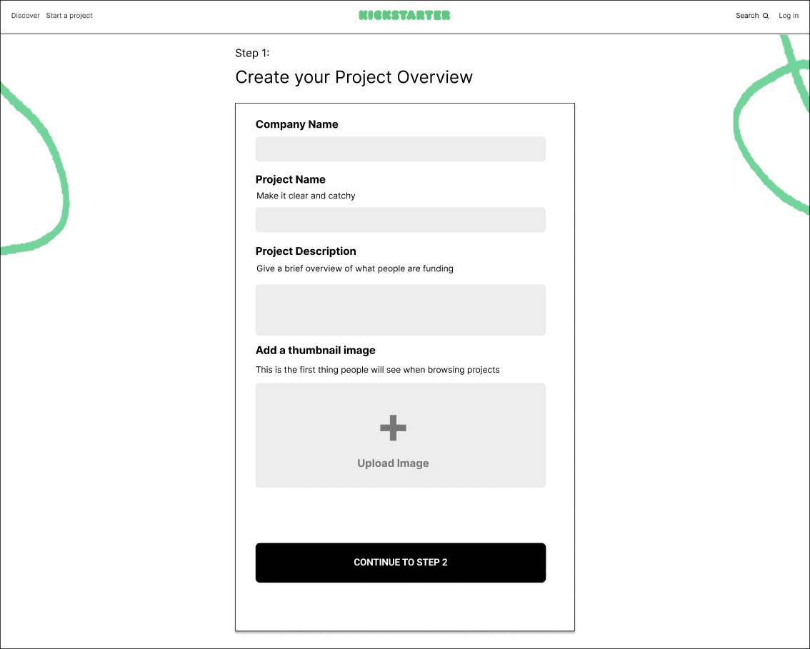
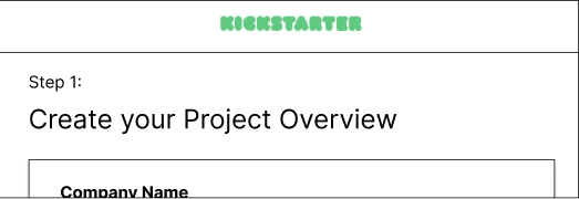
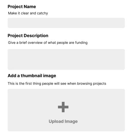
User Interface - Provided
Forming Assumptions
Examining Frustrations
I broke down the screen of the project overview and found possible problems based on assumptions. My assumptions are based or inspired by UX laws and practices.
My assumptions also acted as the core foundations of the redesign with small quality of life changes applied later.
Assumption 01
Provide Step Counts
Users don't complete the goal because they don't know how many steps or the time it takes to finish. Adding progress steps should increase completion rate based on the Goal-Gradient Effect.
Reasoning
Progress steps give clear indication of progress to motivate users.
The closer users are to completion, the likelier they are to complete the task.
Assumption 02

Reduce Uncertainty
The current process does not allow users to see how their information would be articulated into a card on the front end. Inspired AND based on the heuristic of the visibility of system status.
Reasoning
A card preview reflects changes on how the card will appear on the front-end, reducing their uncertainty.
Previews provide user feedback based on changes.
Assumption 03
Provide Resources
Users are paralyzed because they have no guidance on the current form. Providing resource material on writing descriptions or taking good images encourages users to complete the form. Inspired by progressive disclosure.
Reasoning
Providing materials encourages the user to completion instead of paralysis.
Users are less likely to feel overwhelmed when guidance is provided.
Identifying User Experience Interferences
Other Problems
I discovered other problems that could result in lower task completion rates.
Lowers completion rate by providing ways to leave the page.
Background decorations MIGHT lead the users' eyes being led away due to proximity and shape.
No guidance on Upload Image such as image size results in confusion.
Forming Insights
Examining Frustrations
I broke down the screen of the project overview and found possible problems based on assumptions. My assumptions are based or inspired by UX laws and practices.
My assumptions also acted as the core foundations of the redesign with small quality of life changes applied later.
Insight 01
Creators don't know what their project is going to look like when users see it on the front end.
Insight 02
Creators know that a first impression is important but, need some guidance on good titles, descriptions and images.
Insight 03
Creators aren't sure if they'll be able to edit the pre and post launch. This can lead to wasted hours creating perfect copy and images.
Theme of Insights
Uncertainty and lack of guidance are key problems for creators.
Solution Formation
My ideations acted as a checklist of problems. I fixated most of my attention and time to solving the user feedback then — the smaller UX problems.
Design Decision Context
Examining Frustrations
I chose to take a design that was very similar to Kickstarter's current 2024 design.
The goal is to be a "Quick Win" with swift development in mind.
In a worst case scenario, a total redesign would require designers to learn the new layout if it failed and a colossal waste of financial resources and time.