HOMEPAGE
/ PROJECT NAME
Presentime
Presentime
A redesign of the Stream Schedule to resolve the frustrations of users.
A redesign of the Stream Schedule to resolve the frustrations of users.

OVERVIEW
OVERVIEW
As a UX Designer, I anticipate presenting to stakeholders. My experiences with poor-quality presentations in university have motivated me to prioritize excellent audio and visuals in my own work.
I developed a product created to produce high-quality audio and visuals with a setup optimized to a user's environment.
Client
Presentime (Personal Project)
Presentime (Personal Project)
Presentime (Personal Project)
Role
Solo Product Designer
Solo Product Designer
Solo Product Designer
Timeline
Dec 23' - Feb 24'
Dec 23' - Feb 24'
Dec 23' - Feb 24'
RESEARCH
UNDERSTANDING THE PROBLEM
UNDERSTANDING THE PROBLEM
I interviewed eight users remotely who acted as an audience and a presenter. I figured they previous experience as both - mostly in online class presentations.
I interviewed eight users remotely who acted as an audience and a presenter. I figured they previous experience as both - mostly in online class presentations.
How users navigate to the stream schedule.
How users navigate to the stream schedule.
What are the major frustrations when using the schedule.
What are the major frustrations when using the schedule.
Identify the user needs and wants for an ideal stream schedule.

Screensharing allowed for in-depth user pain point identification and analysis.
Screensharing allowed for in-depth user pain point identification and analysis.
USER PAIN POINTS
USER PAIN POINTS
The current experience suffers from a combination of poor findability, not fitting their needs, and a misalignment of a user's mental model.
The current experience suffers from a combination of user experience problems, high
Poor Findability
Users must navigate through several screens and links before arriving to the stream schedule page.
Poor Findability
Users must navigate through several screens and links before arriving to the stream schedule page.
Poor Findability
Users must navigate through several screens and links before arriving to the stream schedule page.
Poor Findability
Users must navigate through several screens and links before arriving to the stream schedule page.
Failure to Meet User Needs
A schedule for one channel only fails to meet the demands of the interviewees. They NEED to be able to see their Followed Channels list at once.
Failure to Meet User Needs
A schedule for one channel only fails to meet the demands of the interviewees. They NEED to be able to see their Followed Channels list at once.
Failure to Meet User Needs
A schedule for one channel only fails to meet the demands of the interviewees. They NEED to be able to see their Followed Channels list at once.
Failure to Meet User Needs
A schedule for one channel only fails to meet the demands of the interviewees. They NEED to be able to see their Followed Channels list at once.
Uneccessary Data
Frustration stems from uneccessary data such as "Views" and "View Count" as users must filter this information out when reading the timetable.
Uneccessary Data
Frustration stems from uneccessary data such as "Views" and "View Count" as users must filter this information out when reading the timetable.
Uneccessary Data
Frustration stems from uneccessary data such as "Views" and "View Count" as users must filter this information out when reading the timetable.
Uneccessary Data
Frustration stems from uneccessary data such as "Views" and "View Count" as users must filter this information out when reading the timetable.
PROBLEM & PRODUCT DESIGN GOALS
PROBLEM & PRODUCT DESIGN GOALS
The current experience is plagued by too many issues to find a theme. Instead, I chose to break down into goals to meet when redesigning.
The current experience suffers from a combination of user experience problems, high
Increase the findability of the feature.
Increase the findability of the feature.
Redesign to reduce cognitive load.
Redesign to reduce cognitive load.
Redesign to fit user needs.
IDEATION
USER INTERFACE IDEATION
USER INTERFACE IDEATION
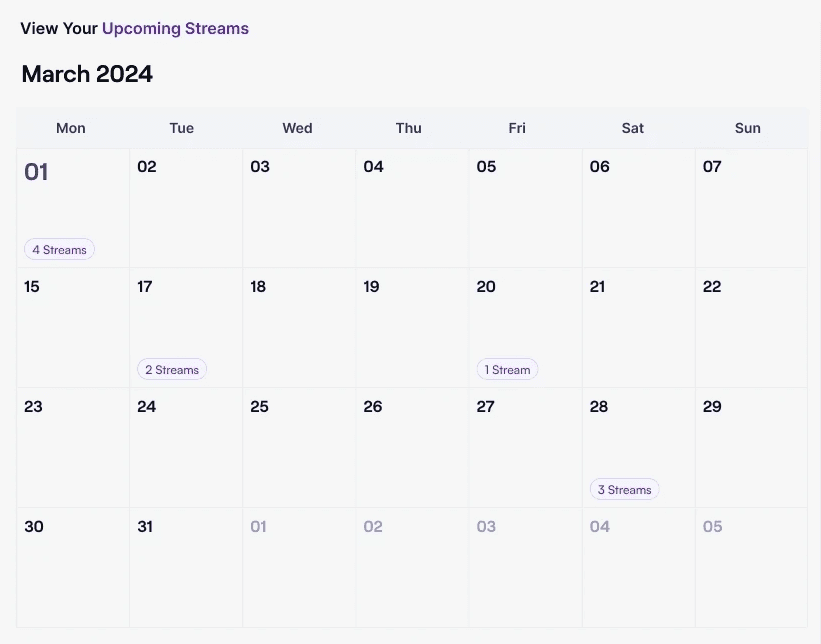
CALENDAR
CALENDAR
I chose a simple calendar layout to keep the number of affordances and signifiers low.
I chose a simple calendar layout to keep the number of affordances and signifiers low.
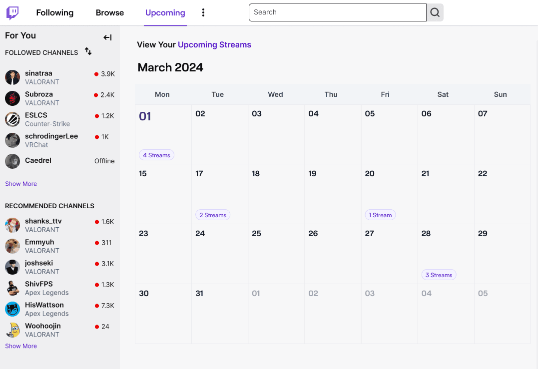
INFORMATION PANEL
INFORMATION PANEL
A panel to showcase ALL a user's Followed Channels.
The ideal layout shows events cascading on the calendar; HOWEVER, users tend to follow 35-100 channels, making the layout unfeasible.
Instead, information is shown in a panel with a vertical scroll.
A panel to showcase ALL a user's Followed Channels.
The ideal layout shows events cascading on the calendar; HOWEVER, users tend to follow 35-100 channels, making the layout unfeasible.
Instead, information is shown in a panel with a vertical scroll.
THE IDEAL EVENT LAYOUT
THE IDEAL EVENT LAYOUT

IDEAL INTERACTION SPECIFIC LAYOUT
IDEAL INTERACTION SPECIFIC LAYOUT

IMPROVING VISUAL HIEARCHY
IMPROVING VISUAL HIEARCHY
Twitch's styling guidelines uses small font sizes and gaps making it difficult to quickly interpret filtered information. I worked around this having text color changes to quickly guide the users' eyes when information is filtered.
Twitch's styling guidelines uses small font sizes and gaps making it difficult to quickly interpret filtered information. I worked around this having text color changes to quickly guide the users' eyes when information is filtered.
Text color is changed to correspond with chosen filters.
Text color is changed to correspond with chosen filters.
INTERACTION DESIGN IDEATION
INTERACTION DESIGN IDEATION
IMPROVING FINDABILITY AND TIME ON TASK
IMPROVING FINDABILITY AND TIME ON TASK
The old solution required navigating through multiple screens. Now, only a singular click is required.
The old solution required navigating through multiple screens. Now, only a singular click is required.
BEFORE
BEFORE
Feature is hard to find.
Feature is hard to find.
Requires 7 to 12 seconds.
Requires 7 to 12 seconds.
Must be repeated for EACH schedule.
Must be repeated for EACH schedule.
AFTER
AFTER

Visible on navigation bar.
Visible on navigation bar
Requires 1 to 3 seconds.
Requires 1 to 3 seconds.
New page removes need for repetition.
New page removes need for repetition.
See Also
See Also
FIA
WORKS
Thank you for visiting!
Let's work together!
© 2024 Fia - Inspired by the world of NieR:Automata.
This portfolio was designed and built by Fia.

FIA
WORKS
Thank you for visiting!
Let's work together!
© 2024 Fia - Inspired by the world of NieR:Automata.
This portfolio was designed and built by Fia.
FIA
WORKS
Thank you for visiting!
Let's work together!
© 2024 Fia - Inspired by the world of NieR:Automata.
This portfolio was designed and built by Fia.
FIA
WORKS
Thank you for visiting!
Let's work together!
© 2024 Fia - Inspired by the world of NieR:Automata.
This portfolio was designed and built by Fia.